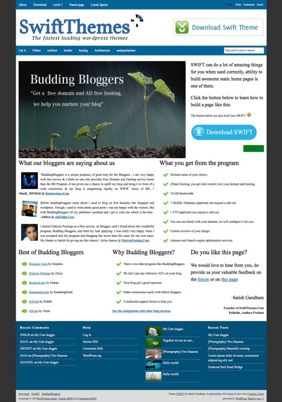
Building static sites and complex page layouts is very easy with SWIFT. In this tutorial I will guide you through the process. You don’t need any prior knowledge about HTML or CSS to understand this article.

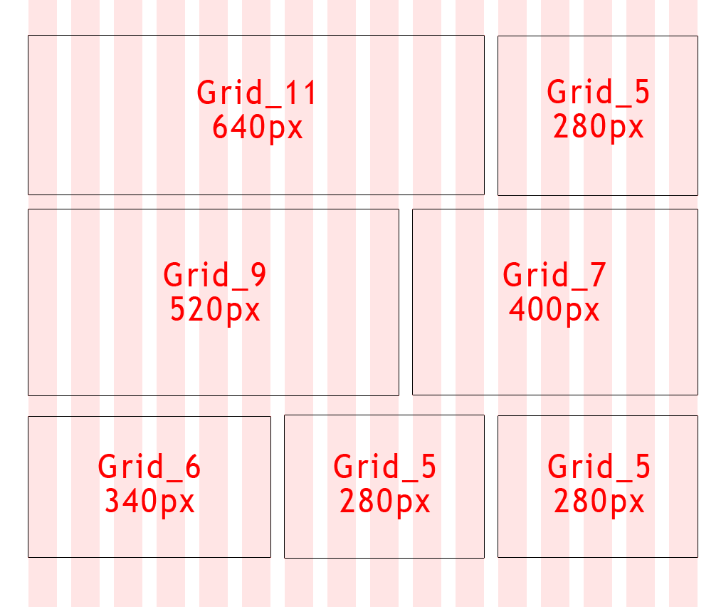
SWIFT uses 960.gs 16 grid CSS framework (Don’t worry if you never heard of it). Every grid cell has a margin: 0 10px. This creates a gutter of 20px. When creating a row, the total width of all elements add up to 960. Each grid cell has a class that specifies what width it will be. Here is the break down of column widths for a 16 column grid.
- 40px
- 100px
- 160px
- 220px
- 280px
- 340px
- 400px
- 460px
- 520px
- 580px
- 640px
- 700px
- 760px
- 820px
- 880px
- 940px
Each width corresponds to a class name formed like this: grid_X where X is a number from the above list. If you want a block with width 940 use class grid_16.

After checking out the visual, you should understand how to create the mock up grid.
- Create a new page, and select “Full Width Blank” template in page attributes on the right.
- Switch the editor to HTML mode.
- Using the widths, match up the class number’s from the list and create a skeleton code as shown below in the editor.
- Once you add the skeleton code, you can go back to visual editor mode and add content to each div like you normally do. Just make sure your images dont over flow.
WYSIWYG editor can be pain in the **** some times, it uses it’s brain and removes/modifies our skeleton, be aware of that. If your comfortable with html mode, create your pages in HTML mode.
Remember to add the clearing div at the end of each row.
[css]<!–First row–>
<div class="grid_11 alpha">
</div>
<div class="grid_5 omega">
</div>
<div class="clear"></div>
<!–<span class="hiddenSpellError" pre="">Seocnd</span> row–>
<div class="grid_9 alpha">
</div>
<div class="grid_7 omega">
</div>
<div class="clear"></div>
<!–Third row–>
<div class="grid_6 alpha">
</div>
<div class="grid_5">
</div>
<div class="grid_5 omega">
</div>
<div class="clear"></div>
[/css]
Now fill in the empty div’s with the html code, make sure you close all the divs.
Skeleton code should be added in HTML mode, not in visual mode.
I added style sheet to WordPress editor in version 5.67 , your posts when published look exactly same as they looked in the editor. To take advantage of this feature switch to full screen mode while editing, if you are not comfortable with full screen mode, at least make sure your editor is more than 960px wide

I added borders to the div’s to serve as visual guide, they wont be there when on published post.
Things to remember
- First and last div of a row should have the class alpha and omega respectively.
- Don’t forget to add <div class=”clear”></div> afer each row.
- Sum of all grid indexes in a row should be 16 like we have 11+5, 9+7, 6+5+5 in the above code.
You can have sub grids to, for example
[css]
<div class="grid_10">
You can add some content here if you want to
<div class="grid_3 alpha">
</div>
<div class="grid_2">
</div>
<div class="grid_2 omega">
</div>
<div class="clear"></div>
[/css]
Sub grids index should add up to the parent grid’s index, 10 in this case. first div should have the class alpha and the last should have class omega.Don’t forget to add <div class=”clear”></div>
Further reading..
http://net.tutsplus.com/tutorials/html-css-techniques/prototyping-with-the-grid-960-css-framework/
This is from where I learnt how to use 960.gs grid, this is the tutorial is one of the major factor that led to the development of SWIFT.
Okay – I read the other tutorial, too. And I understand most of it. What I don’t know is where to add the CSS he uses to style it – that was the main question I mentioned in my first comment. I understand what he wrote, but I don’t know where to put it in Swift. I know there’s that window for custom CSS – but how does it know where to put the stuff? This is fascinating. And tell me this, if you have time – does it make you feel sad or discouraged that someone posted that 960 is old and that everyone is doing 978 now? This is one reason why people like me get lost – everything changes so quickly, and after I learn enough to do what I need to do, I have to run the business I am building the site for – so I forget everything I learned –
Layout specific CSS is already included in SWIFT, you dont have to add it.
960 or 978 doesnt make much difference.
Once you have the custom page created… how do you make it the static custom home page?
Hi I understand the full width blank template and can utilize this for subsequent pages but how do I modify the main/index page? I would primarily be interested in removing the categorization/posted by/comments field more than anything else really.
Can I add widget into grid? such as recent post,or I have to add them manually?
I get building the skeleton code, but where does it go? Is the the page.php or custom-home-page.php to be modified with this skeleton code, or do you simply add a page, choose the Awesome Homepage template, and then use the editor to create the page? If I don’t have to know HTML/CSS to understand this article, or even if I do know HTML/CSS, how will the skeleton cose know what div is to contain post excerpts or links, etc.? Or is the idea of an Awesome Homepage page simply for static content?
My bad, I forgot the most important thing. You should select “Full Width Blank” template.
Awesome home page template is not supposed to be the part of final release. Forgot to delete it.
Oops. 😉
Thanks for clarifying. 🙂
But you didn’t forget it. That’s the first instruction you gave. This is totally cool. It’s taking me so long to catch your vision, but the more I mess around, the more excited I get. This is SO cool. I wish I had more time in my life to climb down inside of all this and make it mine. So many questions about little things – but I’ll figure them out. I don’t think I’ve touched even a third of the things I will end up using – just one bite of the elephant at a time.
once you paste your skeleton code in html mode, switch to visual mode and fill the div’s with content, like you normally write posts.
This idea of awesome home page is only for static content. This can be extend to have dynamic content, but requires template edits.
ok, so I understand how to divide up the spaces, but the html code that you are using to place in the posts in each box. How are you doing that? Simple html w/ an <a href= link at the end? Or is there a way for it to be automatically updated w/ images shown at a certain scale.
I might need to make a website for an Architect that I know soon, and this might be a good theme lay out for him to use. So i'm just wondering exactly how it would work.
Once you add the skeleton code, you can go back to visual editor mode and add content to each div like you normally do. Just make sure your images dont over flow.
Also WYSIWYG editor can be pain in the **** some times, it uses it’s brain and removes/modifies our skeleton, be aware of that. If your comfortable with html mode, create your pages in HTML mode.