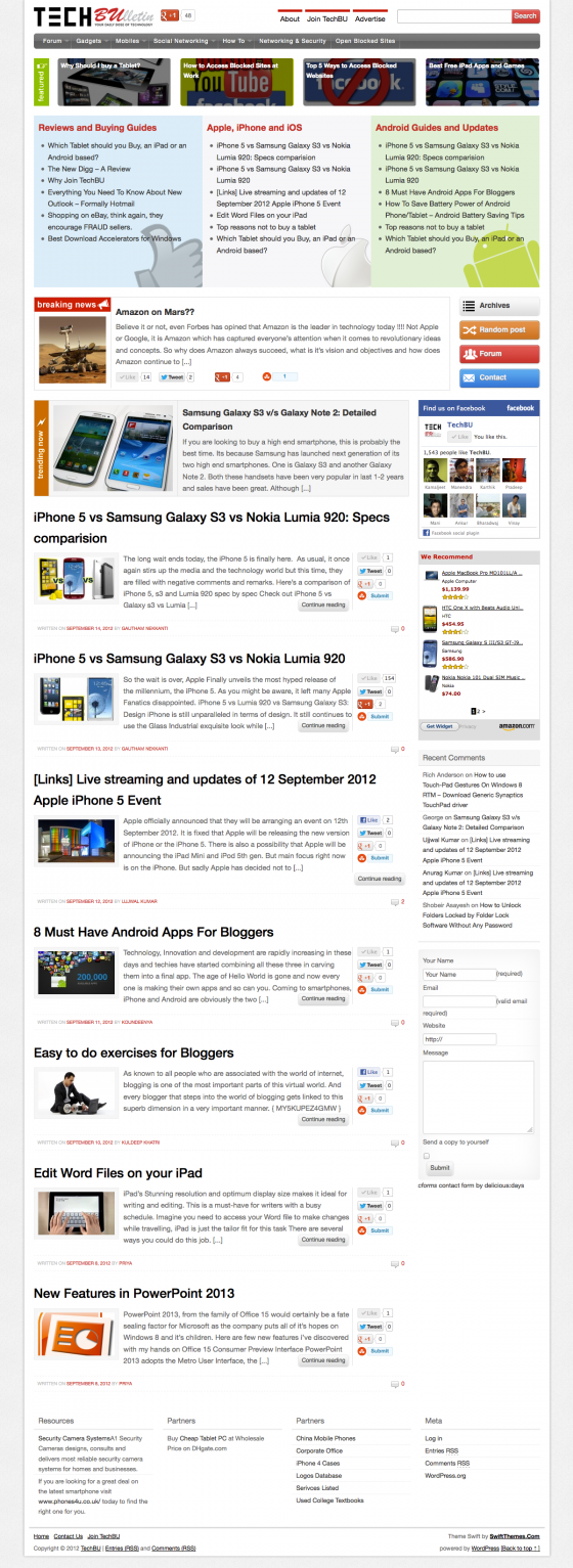
Redesign of TechBU was due from a long time, and I finally did it this week.
When I’m searching for answers on Google, or stumbling, or browsing leisurely the designer and developer in me is constantly looking for the color schemes, layouts, innovative placements and fancy java script effect. They were all put to use in the designing the child theme of Swift for TechBU, a theme that’s inspired from all around the web.
Here is the list of sites from which the design is inspired from
Apple.Com

I always wanted a design with 3+ column layout for TechBU, even for this site to ( A new look is in the pipeline 🙂 ). But when designing for monitors at 1024*768px resolution, three columns looks cramped with awkwardly small lines. Luckily there are not many users on those old monitors today, thanks to the LCDS and the notebooks. When I checked my stats they were less than 10%.
This 10% wasn’t enough to convince me to goto 1200px wide design. I often visit apple.com but the launch of iPhone 5 kept me on the site longer than usual, that’s when I said to myself, when the leaders in design innovation and the company obsessed with user experience and usability makes the move to 1200px wide design why not me, and the redesign was started.
Apart from the site width, other things inspired from Apple are
- Navigation, on hover and active links have a very different and fresh styling though.
- Font color.
TheNextWeb.Com
Featured section on the homepage is inspired from TheNextWeb.Com. I’m impressed with the post navigation on it, that will added to TechBU in the next iteration.

digital-photography-school.com
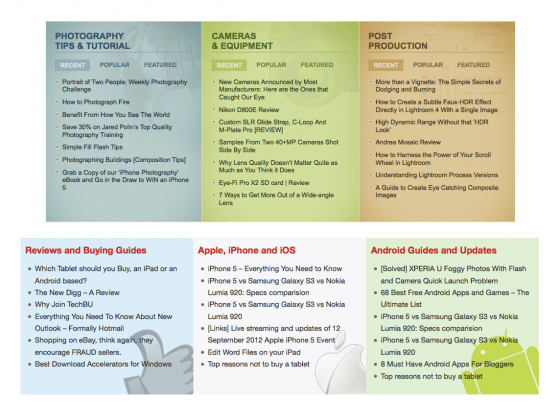
The three colored boxes are taken from this site.

The nice little sticky header is inspired from TechCrunch.Com, the Social share icons are taken from Mashable and the body background is taken from SmashingMagazine.
[box type=”note” size=”large”]
Combing all these nice things we got a design that every tech blog would envy. If you would like a unique design like TechBU for your blog, contact me for a quote.
If you are contemplating on the purchase of Swift, buy now using the code TechBU and get 35% OFF. This is the best offer since the launch of Swift Premium.
*Offer valid till 27th September 2012
[/box]

Love your design, Never seen a blog with so many content in Homepage ! Great work
I like the new freatured post style 🙂
i love this theme. i like to upload this,thanks for the design
Wow Nice design and am impressed with this new look…
Great work satish…
these options are available only on paid version? or also in free version?
This is a customization of Swift. Can be done with both paid and free versions.
so, can you make a guide on how to do these customization in swift?
I love the new design. I have managed to create the TheNextWeb featured post section but its not as light as yours.