As I told you in my post here, version 5.67 of SWIFT is something that I always wanted as a blogger. It’s mission accomplished for me. Now that I have something that I’m proud of, it’s time to present it to the world in its best face.
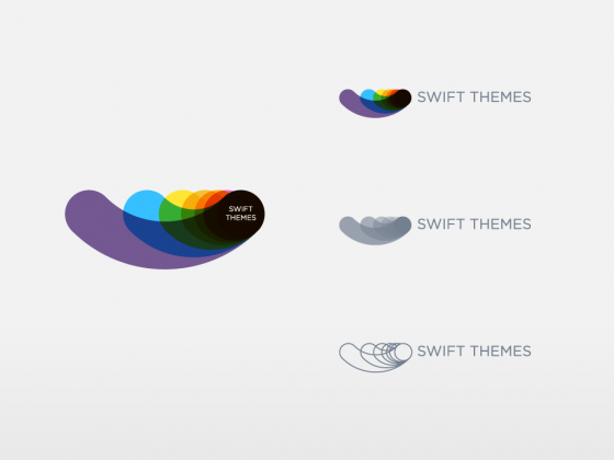
I wanted a logo that represents the objectives of SWIFT, and I wanted it to be designed by a professional. So I went to logo pond and contacted some active designers there. David Pache from Helvetic brands was the first one to respond to my mail, after a small talk he gave me something which he already designed and not using as my budget for the logo was small.
This is the first logo he showed me
Honestly, I dint like it when I first saw it. I was looking for something like the ones below. But slowly the logo designed by David got into my head, every time I see it I like it more than before. It gets into you slowly. Once I decided this is the logo for my site, we played with the colors and tweaked the shape to have the final logo 🙂


The new logo of SWIFT represents Speed, Options, ease of customization and scalability.
Speed: Light colours
Options: Various colours
Ease of customization: Smooth curves and the shape.
Scalability: Various sizes of the shape used in the logo represent the ease at which one can use SWIFT to build a very basic minimal blog to a very complex colorful blog.
Home page design
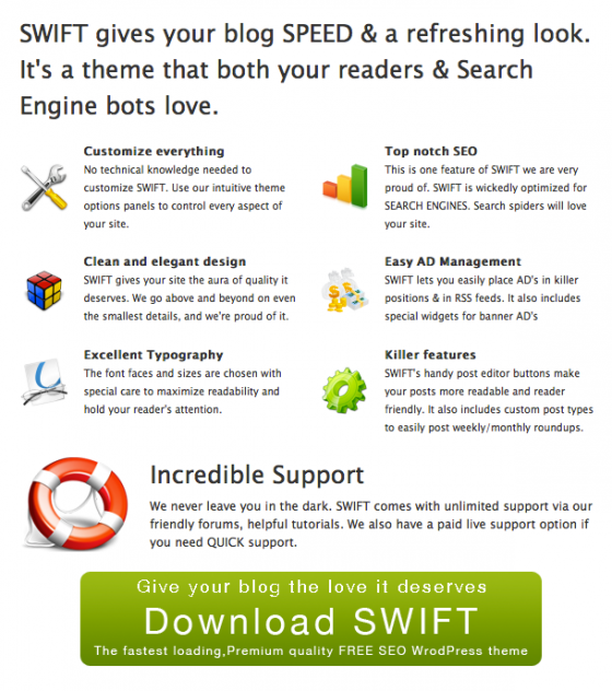
The main idea of the new home page is to give quick idea of what SWIFT is for the new users. Research says that people read a web page diagonally. So I have put the logo and the important information about SWIFT in the diagonal to grab the user attention. The first half of the diagonal we have
It tells the reader what SWIFT is and points them to immediate “Call to ACTION” that is to download. If they are not convinced at this point, they move further down the diagonal, to find the awesome features of SWIFT. Now that I convinced them why SWIFT rocks, there is an immediate call to action below it.
 Testimonials and the showcase are there to increase the desire of the reader in the product, SWIFT.
Swiftthemes run pretty smooth on best web hosting server.
PS1: Design of the interior pages is inspired from the design of SmashingMagazine.Com it’s still a work in progress, Its gonna get better in the coming days.
PS2:If you want your customization, or review of SWIFT to be included on the home page, drop me a mail through this contact form.
Constructive criticism and feedback appreciated, if you are reading the post in your feed reader, visit the site.


Hi, Just wanted to say well done for the fabulous theme.
I’m having a slight problem with the actual layout of the posts. Is there any way that I can display images in the thumbnail box rather than the swift logo? For example one of my posts include a bar chart; could this not be displayed on the front page of the post which you could then click into rather than a black and white swift logo?
Please reply soon as the deadline for my blog is coming up!
Thank Youuuu xx
Hey again Satish
Can you PLEASE PLEASE PLEASE PLEASE PLEASEEEE get back to me as soon as you can. I’m growing to love the theme except my teacher wont allow us to use it unless you can see picture thumbnails on the post rather than he logo. I’m sure there’s a way and I just need some advice on how.
Thank youu x
Follow the instructions on that post http://swiftthemes.com/2010/11/wordpress-themes/swift/update-version-5-70-of-swift-says-goodbye-timthumb/
http://swiftthemes.com/2010/11/wordpress-themes/swift/update-version-5-70-of-swift-says-goodbye-timthumb/
Thank you so much! The only thing now is that I have to go back and set all the posts to the featured image. Is there an easier way of doing this? If not, is there a way I can set an image as ‘featured’ without having to re-attach the image again?
Any news? x
Hello,
I recently activated your theme for my blog. For some reason my pages wont appear on the blog. The only way I can see them is if i search them or type in the pages URL…is there something that you can provide me with so that my pages can be seen?
thank you
Hi, Satish.
In March, I noticed you had an upgrade available (I’ve been using your SWIFT theme for over a year and loved it) but when I downloaded the upgrade, it caused my blog’s appearance to lose all the formatting and all widgets, AND from the WordPress dashboard, the theme, plugin and appearance tabs all disappeared as well. I’ve tried upgrading to the most recent WP and uploaded your most recent template but nothing is working.
Thanks so much …
Delete the current theme through ftp, and install a fresh copy of the theme.
Hi Satish.
I really love your theme and the logo. I just wonder if there is any possibility to remove the logo from my front page, right under the lower menu? I can’t make it go away. It is there as a clickable link to the latest post, like a thumbnail.
Please tell me if it is possible to remove it, thanks.
http://swiftthemes.com/forums/bug-report-suggestions-2/appear-image-betwen-slider-first-post-1034/
Thank you 🙂
Keep up the good work
Hi Satish, Nice logo you have there. I’ve been using your theme for the last few weeks. AND I LOVE YOUR THEME. So easy, smooth and seo friendly.
Thanks 🙂
Keep an eye on the premium version launch, it will be much better than the free version.
Hey Satish, I love the logo and its smooth. hey also a quick question, If there are enhancements that I could suggest or recommend, where do you think I should go, I love your theme and thought that I could contribute in a way.
Thanks 🙂
you can send me a mail through this form
http://swiftthemes.com/contact-me/
or leaving a comment on the blog will do.