Difference between revisions of "How to build business sites with Swift"
(→Row 3) |
(→Stage 0: Setting up the outer skeleton) |
||
| (23 intermediate revisions by 2 users not shown) | |||
| Line 1: | Line 1: | ||
[[File:MYFOLIO.jpg |200px|thumb|right|Lets convert this to a WordPress site using Swift]] | [[File:MYFOLIO.jpg |200px|thumb|right|Lets convert this to a WordPress site using Swift]] | ||
Lets learn this by example. This tutorial teaches you how to convert the PSD on the right into a WordPress site using Swift. | Lets learn this by example. This tutorial teaches you how to convert the PSD on the right into a WordPress site using Swift. | ||
| − | + | The finished site can be found [http://demos.swiftthemes.com/swift-folio/ here]. | |
| + | |||
| + | To follow the tutorial easily, please take sometime to go through the list of helpful classes [[Helpfull_CSS_classes| here]] | ||
| + | |||
| + | == Stage 0: Setting up the outer skeleton == | ||
| + | |||
| + | # First install the [https://siteorigin.com/page-builder/ page builder] plugin from [https://siteorigin.com SiteOrigin]. | ||
| + | Don't worry about it increasing the load on your server or it reducing the speed. Swift automatically removes the unnecessary scripts and styles. | ||
| + | # In your WordPress dashboard goto settings -> page builder and set | ||
| + | ## Set the mobile width to 768 | ||
| + | ## Set ro bottom margin and row gutter to 20px if Airy Layout setting in design options is set to regular, 40px if set to airy, 60px if set to more airy and 80px if set to lot more airy. | ||
| + | ## Set the full width container as '''#wrapper'''. | ||
| + | |||
| + | [[File:Page builder settings for Swift WordPress Theme.jpg|400px|thumb|center]] | ||
== Stage 1: Setting up the outer skeleton == | == Stage 1: Setting up the outer skeleton == | ||
| Line 65: | Line 78: | ||
.hero{padding:80px 0;color:#FFF} /* adding vertical padding and setting the color to white */ | .hero{padding:80px 0;color:#FFF} /* adding vertical padding and setting the color to white */ | ||
.hero h3{font-weight:lighter;font-size:24px;margin:0} /* Removing margin for text above and below the main one so that we can use the lines height of h1 for even spacing above and below.*/ | .hero h3{font-weight:lighter;font-size:24px;margin:0} /* Removing margin for text above and below the main one so that we can use the lines height of h1 for even spacing above and below.*/ | ||
| − | .hero h1{font-weight:bold;font-size:72px;line-height:1. | + | .hero h1{font-weight:bold;font-size:72px;line-height:1.2em;margin:.25em 0;letter-spacing:-2px} |
</pre> | </pre> | ||
| + | |||
====Slider==== | ====Slider==== | ||
First three steps as same as above. | First three steps as same as above. | ||
| − | # Edit the widget and add the window | + | # Edit the widget and add the window width slider. You can read about sliders and various setting available [[How_to_create_a_slider_from_gallery_images | here]] |
# For the first slide add classes <code>hero center</code>, remove the title and for the caption add the following html. By adding hero class, we are using the styles we used in the earlier section. | # For the first slide add classes <code>hero center</code>, remove the title and for the caption add the following html. By adding hero class, we are using the styles we used in the earlier section. | ||
<pre> | <pre> | ||
| Line 122: | Line 136: | ||
Set the widgets class to center. | Set the widgets class to center. | ||
First line adds an icon from the [[http://fontawesome.io/icons/ FontAwesome Icons]] bundled with the theme. Class <code>fa-4x</code> specifies the size of the icon. | First line adds an icon from the [[http://fontawesome.io/icons/ FontAwesome Icons]] bundled with the theme. Class <code>fa-4x</code> specifies the size of the icon. | ||
| + | |||
''You can also use the visual editor widget for this purpose, but no point using big guns for a task as simple as this'' | ''You can also use the visual editor widget for this purpose, but no point using big guns for a task as simple as this'' | ||
# At this stage your widget sticks to left most side of the browser window. To fix it, edit the row and add class <code>hybrid</code> to it. | # At this stage your widget sticks to left most side of the browser window. To fix it, edit the row and add class <code>hybrid</code> to it. | ||
| + | Our icons at this stage are black, lets change it teal. Also their position is little of the center because of the right margin they have. Also while we are here, lets also adjust the headings | ||
| + | Append this to page CSS | ||
| + | <pre> | ||
| + | h4{margin:0;line-height:2em} | ||
| + | .fa-4x:before{margin:0;color:#00a19e} /* We are using .fa-4x because we know thats the only place we are going to use them, so there won't be any conflicts. Ideally you should give the row a class and target the icons in the row */ | ||
| + | </pre> | ||
==== Tips and Gotchas ==== | ==== Tips and Gotchas ==== | ||
# Swift lets you choose from 4 different FontAwesome sets at '''design options/advanced'''. If an icon doesn't appear, make sure your selected icon set includes that icon. | # Swift lets you choose from 4 different FontAwesome sets at '''design options/advanced'''. If an icon doesn't appear, make sure your selected icon set includes that icon. | ||
# Page builder lets you easily duplicate rows and widgets. So instead of adding the widgets to each column and then adding classes to them, duplicate the widget in the first column and then move it to other columns. Then you can quickly edit their content. | # Page builder lets you easily duplicate rows and widgets. So instead of adding the widgets to each column and then adding classes to them, duplicate the widget in the first column and then move it to other columns. Then you can quickly edit their content. | ||
| + | |||
| + | ===Row 4 === | ||
| + | This row is a bit tricky. On the left we have some text and an image on the right. | ||
| + | The image serves no purpose except for the visual balance. We do not want a blank image on mobile sites. | ||
| + | Keeping this in mind, lets proceed to building row 4 | ||
| + | |||
| + | *Create a row with two columns. | ||
| + | *In the first column add a text/visual editor widget and the following html to it. Here we are using the column shortcode that comes with Swift instead of using page builder to create these columns because it is a simple task and we do not want the overhead of page builder here. | ||
| + | <pre> | ||
| + | <h3 class="row-title">Services</h3> | ||
| + | |||
| + | Lorem ipsum dolor sit amet, consectetur adipisicing elit, sed do eiusmod tempor incididunt ut labore et dolore magna aliqua. | ||
| + | Ut enim ad minim veniam. | ||
| + | <br><br> | ||
| + | |||
| + | [twocol_one class="alpha"] | ||
| + | <i class="fa fa-3x fa-globe"></i><br> | ||
| + | <h4>Some title</h4> | ||
| + | You asked, Font Awesome delivers with 40 shiny new icons in version 4.3. Want to request new icons? | ||
| + | <br><br> | ||
| + | [/twocol_one] | ||
| + | [twocol_one class="omega"]<i class="fa fa-3x fa-globe"></i><br><h4>Some title</h4> | ||
| + | You asked, Font Awesome delivers with 40 shiny new icons in version 4.3. Want to request new icons? | ||
| + | <br><br> | ||
| + | [/twocol_one] | ||
| + | <br><br> | ||
| + | <div class="clear"></div> | ||
| + | [twocol_one class="alpha"]<i class="fa fa-3x fa-globe"></i><br><h4>Some title</h4> | ||
| + | You asked, Font Awesome delivers with 40 shiny new icons in version 4.3. Want to request new icons?[/twocol_one] [twocol_one class="omega"]<i class="fa fa-3x fa-globe"></i><br><h4>Some title</h4> | ||
| + | You asked, Font Awesome delivers with 40 shiny new icons in version 4.3. Want to request new icons?[/twocol_one] | ||
| + | <div class="clear"></div> | ||
| + | </pre> | ||
| + | |||
| + | Leave the other column blank. | ||
| + | |||
| + | * Now edit the row and under '''row styles/attributes/row classes''' add classes <code>hybrid pad_tb_2x</code>, below that there is CSS styles field. Add the following css there. | ||
| + | <pre> | ||
| + | background:#f0f0e8 url('http://demos.swiftthemes.com/swift-folio/wp-content/uploads/2015/03/services-bg.jpg') no-repeat 108% 50%; | ||
| + | margin-top:60px; /* This row appears to close to the one above it, this gives it some extra spacing */ | ||
| + | </pre> | ||
| + | What the above code does is spans the background image across the empty column. | ||
| + | ===Row 5=== | ||
| + | Though this appears as two rows we will be treating it as one and add two widgets | ||
| + | #Text widget | ||
| + | #Smart & Sexy posts | ||
| + | |||
| + | Text widget is same as the one we used in row 2 except for content, so duplicate it and drag it to row 5 and update its content. | ||
| + | |||
| + | ==== Portfolio section ===== | ||
| + | [[File:Find-the-row-width.jpg|400px|thumb|right|Finding the row width developer tools or firebug]] | ||
| + | If you right click on the row and click on inspect element, you will find that the row width is 1160px. | ||
| + | We want 4 columns in portfolio section. | ||
| + | i.e 1160/4=290px wide images. | ||
| + | I choose the height as 194px based on the aspect ratio of most images. | ||
| + | |||
| + | Based on the above info fill the options of [[Smart and Sexy Posts widget]]. You can read more about it and other widgets [[widgets|here]] | ||
| + | ===Row 6=== | ||
| + | Row 6 is almost same as row 2. In this case unlike row 5, we can duplicate the entire row and update its content. | ||
| + | |||
| + | ===Row 7=== | ||
| + | This is a bit tricky. If you understand this clearly, then you will be a PRO. | ||
| + | |||
| + | This row is different from others. Here the background color spans the entire width and the actual content sits at the center like other rows. | ||
| + | |||
| + | To achieve this we use a row with in other with the help of layout builder. Lets go through the process step by step. | ||
| + | |||
| + | #Create a new row with one column and | ||
| + | #*Add classes <code>pad_tb_2x pull_b_2x</code>, first to add top and bottom vertical padding. Second (pull_b_2x) to make the copyright container stick to it. | ||
| + | #*Add <code>last-row</code> as cell class. This adds last-row as class to our two columns. | ||
| + | #*Set its background to black (#000) | ||
| + | #Now to this row, add the layout builder widget. | ||
| + | #In this widget add a new row with two columns with their ratio as thirds i.e, 75%,25% | ||
| + | #Add class <code>hybrid</code> to this row. This aligns our two columns at the center. | ||
| + | #In the first column add text widget and add the contact form short code. ( We used contact from 7 for this purpose) | ||
| + | #In the second column add two text widgets with the following content. | ||
| + | First is the unordered list of social media profiles and second is a email subscription form. [http://sendy.co/?ref=yN70l Sendy] in this case. | ||
| + | <pre> | ||
| + | <h4>Stay connected!</h4> | ||
| + | <ul class=""> | ||
| + | <li><a href="" class="fa fa-facebook">/SwiftThemes</a></li> | ||
| + | <li><a href="" class="fa fa-twitter">/SwiftThemes</a></li> | ||
| + | <li><a href="" class="fa fa-google-plus">/SwiftThemes</a></li> | ||
| + | <li><a href="" class="fa fa-youtube">/SwiftThemes</a></li> | ||
| + | </ul> | ||
| + | </pre> | ||
| + | |||
| + | <pre> | ||
| + | <h4>Join SwiftThemes newsletter</h4> | ||
| + | <form action="http://letters.SwiftThemes.Com/subscribe" method="POST" accept-charset="utf-8"> | ||
| + | <p><label for="name">Name</label><br/> | ||
| + | <input type="text" name="name" id="name"/> | ||
| + | </p> | ||
| + | <p> | ||
| + | <label for="email">Email</label><br/> | ||
| + | <input type="text" name="email" id="email"/> | ||
| + | </p> <input type="hidden" name="list" value="XWswb6bNthepgrDCGC7pLg"/> | ||
| + | <p><input type="submit" name="submit" value="Subscribe" class="full btn alignright btn-primary" id="submit"/></p> | ||
| + | </form> | ||
| + | </pre> | ||
| + | |||
| + | Add class sm to the first widget in second column. | ||
| + | |||
| + | Here is the CSS used to style this row | ||
| + | <pre> | ||
| + | |||
| + | .last-row{color:#CCC} | ||
| + | .sm ul li{margin:0;list-style:none;line-height:32px;border:none;font-weight:bold;width:50%;float:left; | ||
| + | padding:0} | ||
| + | .sm li a{color:#FFF} | ||
| + | .sm ul li .fa:before{font-size:24px;line-height:32px;margin:0} | ||
| + | </pre> | ||
| + | == Finishing touches == | ||
| + | If you check the final site at this stage, you will see horizontal scroll bars. Thats because page builder adds negative margin to rows with multiple columns. | ||
| + | I do not understand their logic at this stage, and we do not need that negative margins on the row. | ||
| + | |||
| + | In this case the rows are 3 and 4 with count starting at 0, lets fix that now | ||
| + | Append this to page CSS | ||
| + | <pre> | ||
| + | #pg-6-2, #pg-6-3{margin-left:0;margin-right:0} | ||
| + | </pre> | ||
| + | |||
| + | One more problem is, if you see the site on mobile, the size of text is too big and you will barely see anything useful. | ||
| + | Add the following code to '''page css/only for mobiles''', this makes sure that the code doesn't affect our site when viewed on desktops and tablets. | ||
| + | <pre> | ||
| + | .hero{padding:20px 0;color:#FFF} | ||
| + | .hero h3{font-weight:lighter;font-size:16px;margin:0} | ||
| + | .hero h1{font-weight:bold;font-size:32px;line-height:1.2em;margin:.5em 0;letter-spacing:-1px} | ||
| + | </pre> | ||
| + | |||
| + | One more problem is, the know more button on the hero slide appears to close to the text. Lets give it some top margin when viewed on desktop. | ||
| + | For that add <code>.hero .btn {margin-top:60px}</code> in CSS for desktops. | ||
Latest revision as of 09:13, 29 May 2015
Lets learn this by example. This tutorial teaches you how to convert the PSD on the right into a WordPress site using Swift. The finished site can be found here.
To follow the tutorial easily, please take sometime to go through the list of helpful classes here
Contents
Stage 0: Setting up the outer skeleton
- First install the page builder plugin from SiteOrigin.
Don't worry about it increasing the load on your server or it reducing the speed. Swift automatically removes the unnecessary scripts and styles.
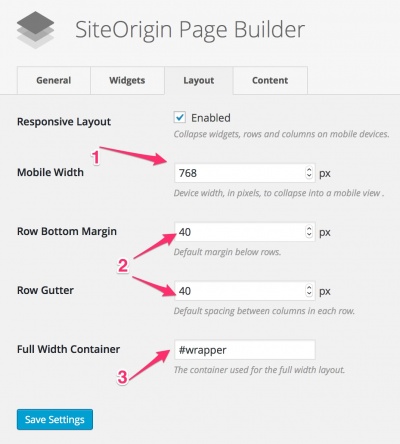
- In your WordPress dashboard goto settings -> page builder and set
- Set the mobile width to 768
- Set ro bottom margin and row gutter to 20px if Airy Layout setting in design options is set to regular, 40px if set to airy, 60px if set to more airy and 80px if set to lot more airy.
- Set the full width container as #wrapper.
Stage 1: Setting up the outer skeleton
As this site is having the navigation style of SwiftModern, we will use SwiftModern child theme to build this site. The same site can be done with Swift, but you will have a bigger header.
- Goto Swift options and upload a logo thats 32px tall and less than 220px wide.
- Goto appearance/menus and assign the three menus. If you are using regular Swift without child theme then there will be 6 locations.
- Set the site width to 1160px. Thats the maximum width you can have for scree with horizontal resolution of 1200px.
- In design options -> layout settings, set the layout to hybrid or fixed. We will go with hybrid.
- Set the navigation style to modern in design options -> layout settings and select the remove borders option below it.
- Finally go to design options -> color options
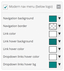
- Check enable custom colors and uncheck all section except for "Modern Nav (Below logo)"
- Set modern nav colors as below
Navigation background: rgb(2, 145, 141)
Navigation border: transparent
Link color:rgb(255, 255, 255)
Link hover bg:rgb(0, 117, 114)
Link hover color:rgb(255, 255, 255)
Dropdown links hover color:rgb(255, 255, 255)
Dropdown links hover bg:rgb(2, 145, 141)
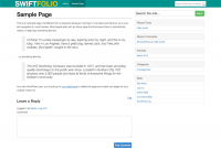
This finishes stage 1, and you site should look something like this. (Focus on the header)
Stage 2: Building the actual page
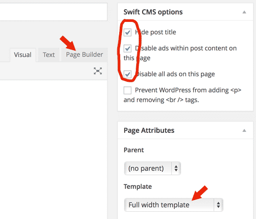
- Create a new page and set the page template as "Full width hybrid template"
- Check hide post title and disable all ads.
- Click on the page builder tab ( shown in image below ).
First row
For the first row there are 2 possibilities and we will explain both.
- Have a single image.
- Multiple images using slider.
Single image
- With the page builder tab selected, click on Add a row and set the number of columns to 1
- Click on the wrench above the row to bring up row settings, add classes
pull_t_2x hero. First one pull_t_2x pulls the row up to stick it to the navigation menu and we use hero class to style this row. - Now click on add widget and add visual editor to this row.
- Click on edit on this widget and under attributes/widget classes add classes
center hybrid pad_tb_2x.
- center centers the content in this row
- hybrid sets the widget width equal to site width, 1160px in this case.
- pad_tb_2x adds padding of 20px above and below the row. If you use pad_tb instead it will be 10px. This value depends on the airy setting in design options / layout options.
- regular = 10px
- airy = 20px
- more airy = 30px
- lot more airy = 40px
Note: we will need more padding than 20px, so we will override it using Custom CSS for the page setting.
While you are here, lest add some content to the widget
<h3>A simple business site built on </h3>
<h1>Swift WordPress Theme</h1>
<h3>It just took us about 2 hours to build this</h3>
<br /><br /><br />
<a href="#" class="btn btn-success btn-lg">KNOW MORE</a>
lets add some custom styles to our row In CSS applied to all devices add
.hero{padding:80px 0;color:#FFF} /* adding vertical padding and setting the color to white */
.hero h3{font-weight:lighter;font-size:24px;margin:0} /* Removing margin for text above and below the main one so that we can use the lines height of h1 for even spacing above and below.*/
.hero h1{font-weight:bold;font-size:72px;line-height:1.2em;margin:.25em 0;letter-spacing:-2px}
Slider
First three steps as same as above.
- Edit the widget and add the window width slider. You can read about sliders and various setting available here
- For the first slide add classes
hero center, remove the title and for the caption add the following html. By adding hero class, we are using the styles we used in the earlier section.
<h3>A simple business site built on </h3>
<h1>Swift WordPress Theme</h1>
<h3>It just took us about 2 hours to build this</h3>
<br /><br /><br />
<a href="#" class="btn btn-success btn-lg">KNOW MORE</a>
You can add as many slides you want Ideally you shouldn't exceed 6. 3 is optimum.
This ends row one and your site should look something like this.
Row 2
Row two is pretty simple. Add a new row and add a visual editor or the simple text widget to it.
For the rows add class pad_tb_2x, and for the widget add class center
Add the following html to it
<h3 class="row-title">About Swift</h3>
Swift theme is a product born from a common need. A need for a <strong>intuitive, fast & lightweight theme</strong>, with complete control over design.
Driven by our obsession with standards and usability, we have crafted to our highest standards,
a theme you and your visitors will be thrilled to use.
Notice the row-title class we added to h3. As there are multiple rows with similar headings, we will be applying the styles to it using this class.
Append the following CSS to Custom CSS for the page
.row-title{
	font-size:48px;
	line-height:1.5em;
	font-weight:bold;
	color:#00a19e;
	margin:0;
	text-transform:uppercase;
}
Row 3
The third row has four columns of equal width. So add a row with 4 equal columns.
- In the first column add a text widget and add the following html.
<i class="fa fa-4x fa-lightbulb-o"></i>
<h4>Brilliant Ideas</h4>
That are elegantly executed to change the way you develop WordPress sites
Set the widgets class to center.
First line adds an icon from the [FontAwesome Icons] bundled with the theme. Class fa-4x specifies the size of the icon.
You can also use the visual editor widget for this purpose, but no point using big guns for a task as simple as this
- At this stage your widget sticks to left most side of the browser window. To fix it, edit the row and add class
hybridto it.
Our icons at this stage are black, lets change it teal. Also their position is little of the center because of the right margin they have. Also while we are here, lets also adjust the headings Append this to page CSS
h4{margin:0;line-height:2em}
.fa-4x:before{margin:0;color:#00a19e} /* We are using .fa-4x because we know thats the only place we are going to use them, so there won't be any conflicts. Ideally you should give the row a class and target the icons in the row */
Tips and Gotchas
- Swift lets you choose from 4 different FontAwesome sets at design options/advanced. If an icon doesn't appear, make sure your selected icon set includes that icon.
- Page builder lets you easily duplicate rows and widgets. So instead of adding the widgets to each column and then adding classes to them, duplicate the widget in the first column and then move it to other columns. Then you can quickly edit their content.
Row 4
This row is a bit tricky. On the left we have some text and an image on the right. The image serves no purpose except for the visual balance. We do not want a blank image on mobile sites. Keeping this in mind, lets proceed to building row 4
- Create a row with two columns.
- In the first column add a text/visual editor widget and the following html to it. Here we are using the column shortcode that comes with Swift instead of using page builder to create these columns because it is a simple task and we do not want the overhead of page builder here.
<h3 class="row-title">Services</h3>

Lorem ipsum dolor sit amet, consectetur adipisicing elit, sed do eiusmod tempor incididunt ut labore et dolore magna aliqua.
Ut enim ad minim veniam.
<br><br>

[twocol_one class="alpha"]
<i class="fa fa-3x fa-globe"></i><br>
<h4>Some title</h4>
You asked, Font Awesome delivers with 40 shiny new icons in version 4.3. Want to request new icons?
<br><br>
[/twocol_one]
[twocol_one class="omega"]<i class="fa fa-3x fa-globe"></i><br><h4>Some title</h4>
You asked, Font Awesome delivers with 40 shiny new icons in version 4.3. Want to request new icons?
<br><br>
[/twocol_one]
<br><br>
<div class="clear"></div>
[twocol_one class="alpha"]<i class="fa fa-3x fa-globe"></i><br><h4>Some title</h4>
You asked, Font Awesome delivers with 40 shiny new icons in version 4.3. Want to request new icons?[/twocol_one] [twocol_one class="omega"]<i class="fa fa-3x fa-globe"></i><br><h4>Some title</h4>
You asked, Font Awesome delivers with 40 shiny new icons in version 4.3. Want to request new icons?[/twocol_one]
<div class="clear"></div>
Leave the other column blank.
- Now edit the row and under row styles/attributes/row classes add classes
hybrid pad_tb_2x, below that there is CSS styles field. Add the following css there.
background:#f0f0e8 url('http://demos.swiftthemes.com/swift-folio/wp-content/uploads/2015/03/services-bg.jpg') no-repeat 108% 50%;
margin-top:60px; /* This row appears to close to the one above it, this gives it some extra spacing */
What the above code does is spans the background image across the empty column.
Row 5
Though this appears as two rows we will be treating it as one and add two widgets
- Text widget
- Smart & Sexy posts
Text widget is same as the one we used in row 2 except for content, so duplicate it and drag it to row 5 and update its content.
Portfolio section =
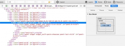
If you right click on the row and click on inspect element, you will find that the row width is 1160px. We want 4 columns in portfolio section. i.e 1160/4=290px wide images. I choose the height as 194px based on the aspect ratio of most images.
Based on the above info fill the options of Smart and Sexy Posts widget. You can read more about it and other widgets here
Row 6
Row 6 is almost same as row 2. In this case unlike row 5, we can duplicate the entire row and update its content.
Row 7
This is a bit tricky. If you understand this clearly, then you will be a PRO.
This row is different from others. Here the background color spans the entire width and the actual content sits at the center like other rows.
To achieve this we use a row with in other with the help of layout builder. Lets go through the process step by step.
- Create a new row with one column and
- Add classes
pad_tb_2x pull_b_2x, first to add top and bottom vertical padding. Second (pull_b_2x) to make the copyright container stick to it. - Add
last-rowas cell class. This adds last-row as class to our two columns. - Set its background to black (#000)
- Add classes
- Now to this row, add the layout builder widget.
- In this widget add a new row with two columns with their ratio as thirds i.e, 75%,25%
- Add class
hybridto this row. This aligns our two columns at the center. - In the first column add text widget and add the contact form short code. ( We used contact from 7 for this purpose)
- In the second column add two text widgets with the following content.
First is the unordered list of social media profiles and second is a email subscription form. Sendy in this case.
<h4>Stay connected!</h4>
<ul class="">
<li><a href="" class="fa fa-facebook">/SwiftThemes</a></li>
<li><a href="" class="fa fa-twitter">/SwiftThemes</a></li>
<li><a href="" class="fa fa-google-plus">/SwiftThemes</a></li>
<li><a href="" class="fa fa-youtube">/SwiftThemes</a></li>
</ul>
<h4>Join SwiftThemes newsletter</h4>
<form action="http://letters.SwiftThemes.Com/subscribe" method="POST" accept-charset="utf-8">
	<p><label for="name">Name</label><br/>
	<input type="text" name="name" id="name"/>
	</p>
<p>
	<label for="email">Email</label><br/>
	<input type="text" name="email" id="email"/>
</p>	<input type="hidden" name="list" value="XWswb6bNthepgrDCGC7pLg"/>
	<p><input type="submit" name="submit" value="Subscribe" class="full btn alignright btn-primary" id="submit"/></p>
</form>
Add class sm to the first widget in second column.
Here is the CSS used to style this row
.last-row{color:#CCC}
.sm ul li{margin:0;list-style:none;line-height:32px;border:none;font-weight:bold;width:50%;float:left;
padding:0}
.sm li a{color:#FFF}
.sm ul li .fa:before{font-size:24px;line-height:32px;margin:0}
Finishing touches
If you check the final site at this stage, you will see horizontal scroll bars. Thats because page builder adds negative margin to rows with multiple columns. I do not understand their logic at this stage, and we do not need that negative margins on the row.
In this case the rows are 3 and 4 with count starting at 0, lets fix that now Append this to page CSS
#pg-6-2, #pg-6-3{margin-left:0;margin-right:0}
One more problem is, if you see the site on mobile, the size of text is too big and you will barely see anything useful. Add the following code to page css/only for mobiles, this makes sure that the code doesn't affect our site when viewed on desktops and tablets.
.hero{padding:20px 0;color:#FFF}
.hero h3{font-weight:lighter;font-size:16px;margin:0}
.hero h1{font-weight:bold;font-size:32px;line-height:1.2em;margin:.5em 0;letter-spacing:-1px}
One more problem is, the know more button on the hero slide appears to close to the text. Lets give it some top margin when viewed on desktop.
For that add .hero .btn {margin-top:60px} in CSS for desktops.

